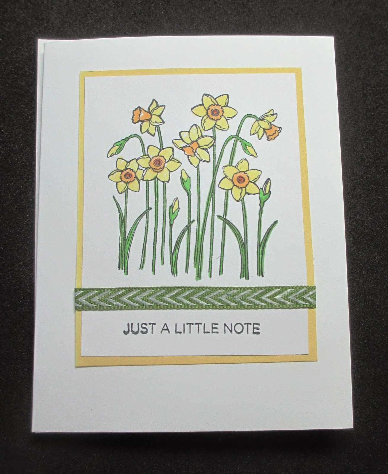
This card began with
retrosketches #156 sketch. I started stamping the circles from
Doodled Designs (Close To My Heart) with Distress ink several times onto Holtz watercolor card stock. I used a water brush to blend out the color. Then mixed a bit of the ink on a block, loaded a brush with color and tapped it for the spatter. The flowers (
Lovely Birthday Occasions, CTMH) were inked with Distress inks - I masked the large flower- and water brushed. The sentiment tag was punched and stamped using
Thoughtful Florals set from Verve. I cut the water color piece and used foam to adhere it to the card base.
This was fun to try - way out of my comfort zone. Now that I look at the pictures, it feels that something should have been added to the yellow flowers. Do they just get lost??
Perhaps a flower with circular design would be better? Kept it monochromatic? I feel another attempt in the future...